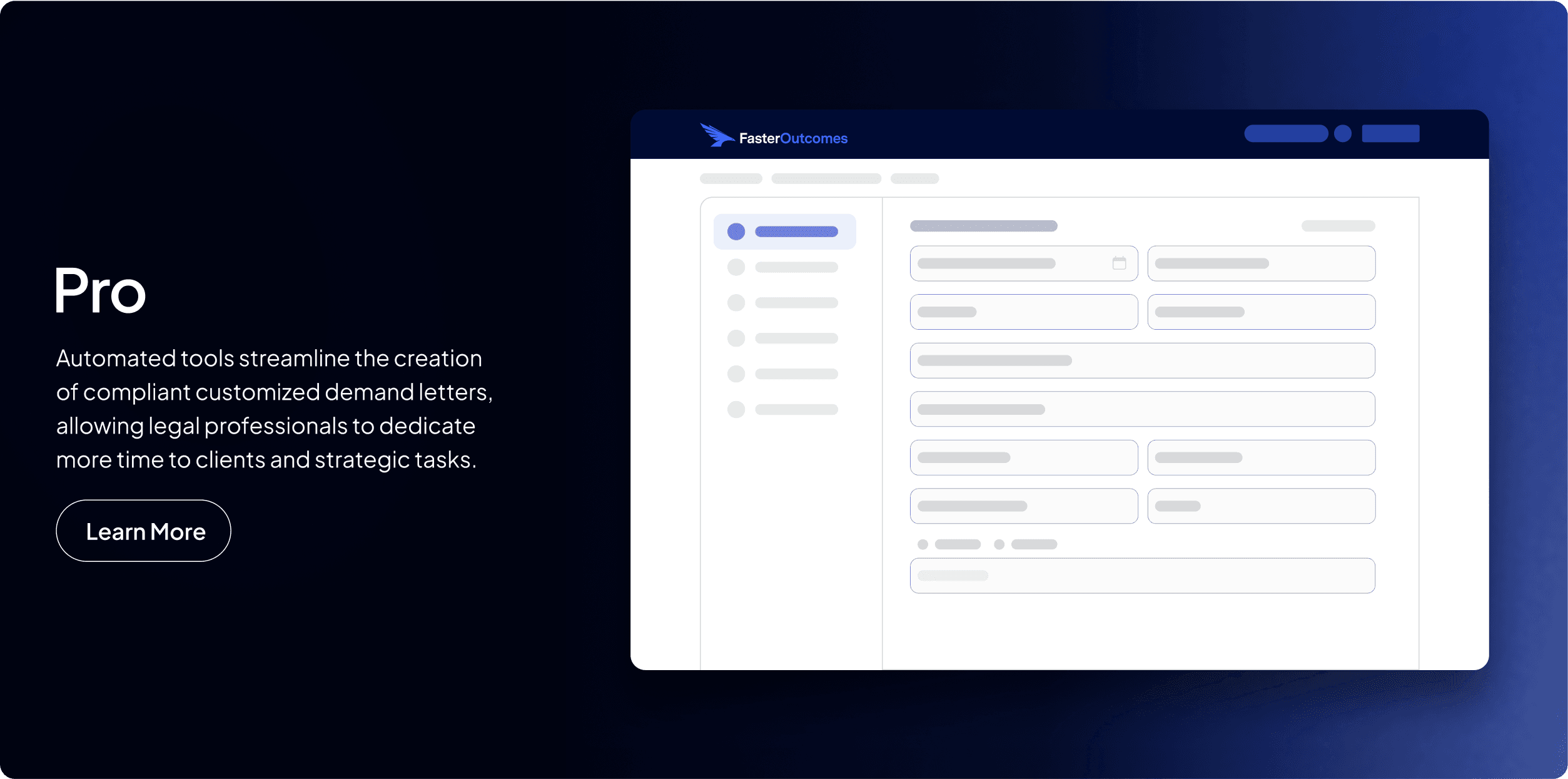
Back

FASTEROUTCOMES

At FasterOutcomes, I joined as the sole Prouduct designer, collaborating directly with leadership to design and build experiences that helped legal teams onboard quickly, find information easily, and feel confident using our AI platform. My role spanned product, marketing, and front-end development; giving me full ownership from idea to implementation.

At FasterOutcomes, I joined as the sole Prouduct designer, collaborating directly with leadership to design and build experiences that helped legal teams onboard quickly, find information easily, and feel confident using our AI platform. My role spanned product, marketing, and front-end development; giving me full ownership from idea to implementation.

Role: Product Designer

Tools: Figma, Figjam

Unified Visual Language


One of my first contributions at FasterOutcomes was building a cohesive design system. I created a new set of guidelines that defined our brand's visual standards—from typography and spacing to color usage and component styling.

These foundations helped unify our marketing and product experiences and became the base for every project I touched, including onboarding, product pages, and support documentation.

Onboarding

Shortly after, I met with the VP of Product to align on one of my first major initiatives: designing a new onboarding experience that would reflect the product’s power while guiding users toward meaningful first actions.


We created this list of goals:

  • Demonstrate value immediately

  • Show real-world applications to users

  • Explore options for multiple user levels

  • Enhance product understanding

  • Streamline signup for a frictionless start

My Approach

User psychology considerations:

  • Paradox of the Active User: Users want to start working immediately, not sit through long explanations.

  • Limited memory: Most users forget what they see in onboarding, so key messages had to be concise and repeated in context later.

  • Animations as engagement, not distraction: Used subtle Lottie animations to add delight without overwhelming users.

Key UX principles guiding my design:

Visibility of system status: Each step clearly showed progress and next actions.

  • User control and freedom: Users could skip ahead at any point.

  • Limit mental load: Each screen focused on a single, impactful feature to avoid information overload.

  • Non-intrusive flow: Onboarding felt like a conversation, not a lecture—respecting the user’s time and focus.

Prototype

To guide users through the process of creating a "New Matter," I designed a five-step wizard that emphasized clarity, control, and visual storytelling.

Design Details

  • Consistent CTA styling: All buttons matched the live product to maintain continuity.

  • Motion-driven clarity: Each step featured a short 2-second Lottie animation that visually explained the action the user could take.

  • Progressive disclosure: The “Next” button appeared only after the animation completed, giving users a moment to absorb the content.

  • User control: An opt-out option was included immediately after users entered their name and number, with an exit icon available throughout the rest of the flow.

  • Smart re-entry: If onboarding was skipped, users would see a small popup under the "New Matter" button on the homepage that pointed them back to where they could begin.


This approach resulted in a branded, frictionless onboarding experience that made users feel confident and guided from the moment they signed up.

HelpScout FAQ Page

To modernize our Help Center experience, I built a fully customized HelpScout FAQ page using HTML, CSS, and JavaScript. One limitation of HelpScout’s CMS was the lack of an H1 or space for an introduction above the search bar. I solved this by writing a custom JavaScript function to inject a friendly prompt “How can we help you today?”,only on the homepage, avoiding visual bugs on other articles.
Later, when the PM restructured the content from four categories down to three and removed a subhead, I ensured the layout still remained accessible and consistent with the brand voice.

To modernize our Help Center experience, I built a fully customized HelpScout FAQ page using HTML, CSS, and JavaScript.

Discover Page

Beyond product design, I collaborated with the marketing team to lead creative direction for several new campaign visuals and web pages. At the time, most visuals relied on generic stock photography. I introduced simplified product UIs and motion-driven storytelling to clearly show how FasterOutcomes helps legal teams win cases and work smarter.
This included:


  • Designing all product cards and hero images

  • Building animated SVG assets and product walkthroughs

  • Aligning typography, spacing, and color use across platforms


I also contributed to the redesign of several key marketing pages such as the homepage and Discover product page. ensuring each touchpoint felt consistent and clearly communicated our product value.

Beyond product design, I collaborated with the marketing team to lead creative direction for several new campaign visuals and web pages.

Beyond product design, I collaborated with the marketing team to lead creative direction for several new campaign visuals and web pages. At the time, most visuals relied on generic stock photography. I introduced simplified product UIs and motion-driven storytelling to clearly show how FasterOutcomes helps legal teams win cases and work smarter.

Discover Product Video

If a user tries to add a card after reaching the maximum hand size, a warning screen appears to let them know they're at capacity.

Reflection

This was one of my first deep dives into motion design and using Lottie files. I enjoyed the challenge of designing an onboarding wizard that balanced clarity with brand storytelling, and appreciated thinking through the lens of both a designer and end user.
Seeing the brand guidelines I created come to life across product, web, and marketing materials was incredibly rewarding. It gave me a holistic view of how thoughtful, consistent design can elevate the experience across an entire platform.

Back to top

Zac Salas

Zac Salas