Building Immi
Reimagining a Home Feed
About
Immi is a social platform aimed to help people connect and communicate prioritizing human connection over addictive consumption. As a Design Consultant I partnered with the founders to establish a brand and system philsophy. I led the development of comprehensive brand guidelines and a scalable production enviroment via custom themes.
Role:
Design Consultant, Design Engineer
Tools:
React Native
Next.js
TypeScript
Live Prototype
The Misson
Immi was started on the idea to create a healthier form of social media. I joined as a Design Consultant as they launched the Beta version of the app. First thing I noticed what the lack of a cohesive identity. I sat down with the founders and created a mood board, I instructed them to identify any and all images, brands, ads, ideas that they felt represented immi. We identified Hinge's "Designed to be Deleted" ethos as our north star. From this I came up with the internal slogan of "Connection over Consumption" which would be the core of the brand philosophy moving forward.
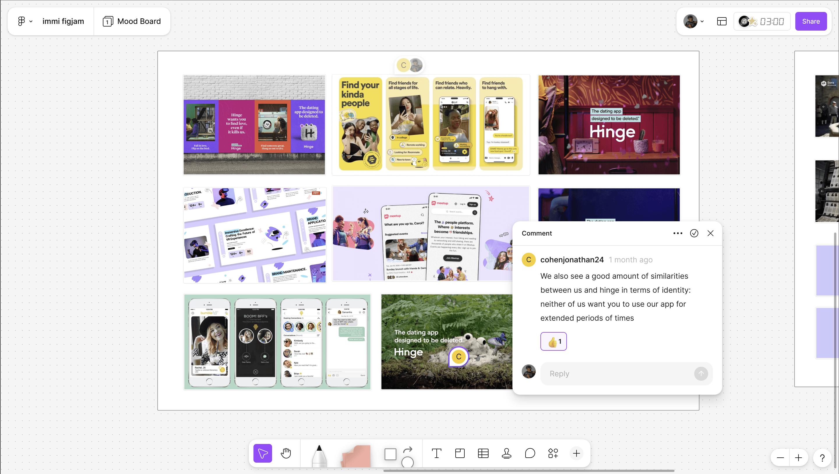
Figjam Competitive Analysis
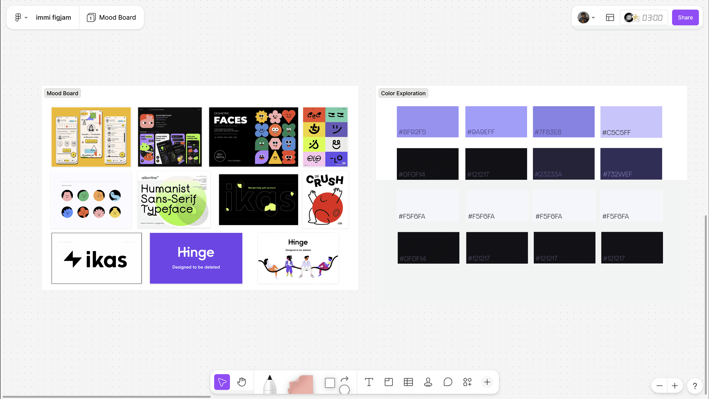
Figjam Inspo & Colors
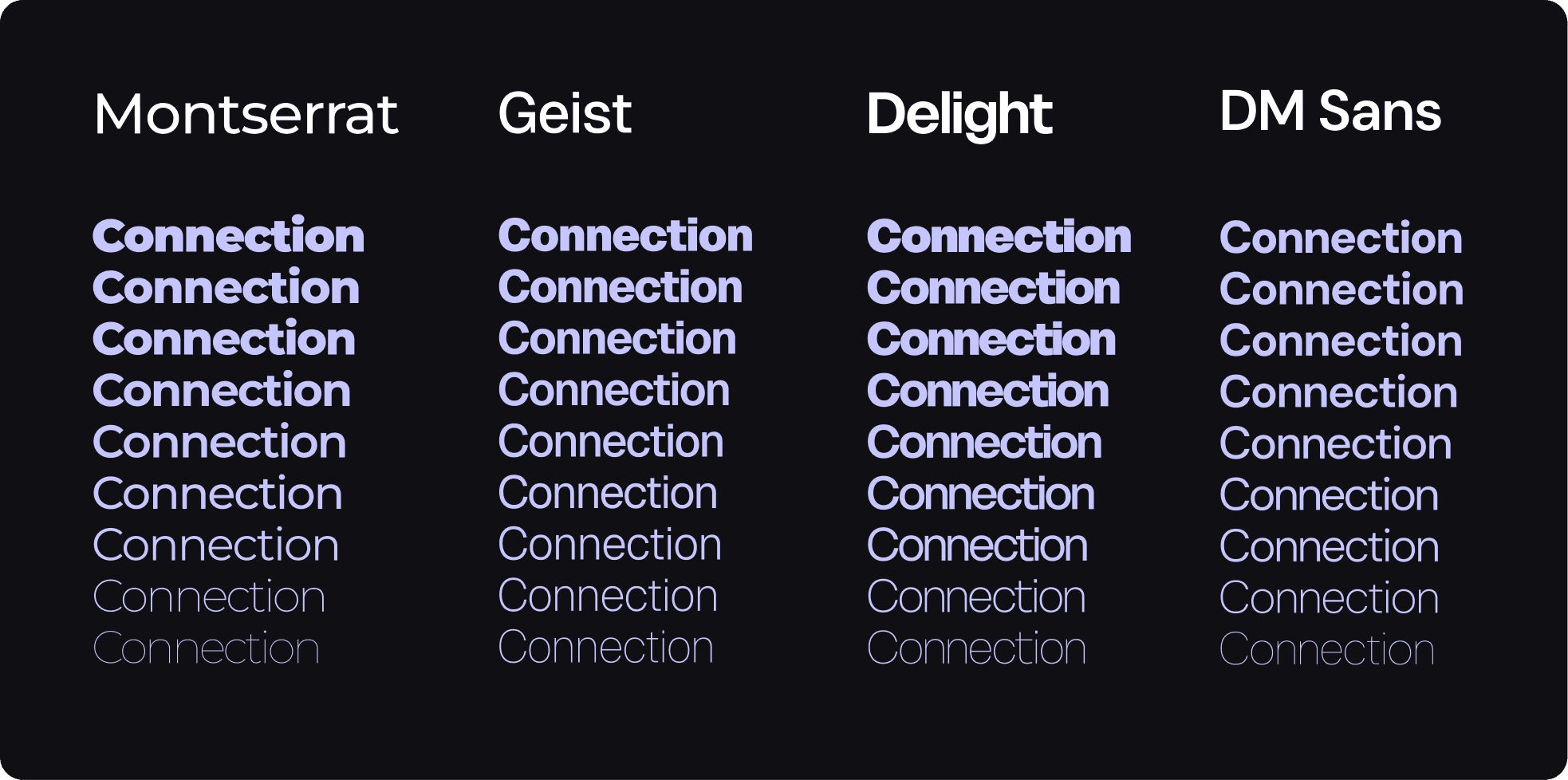
Font Choices
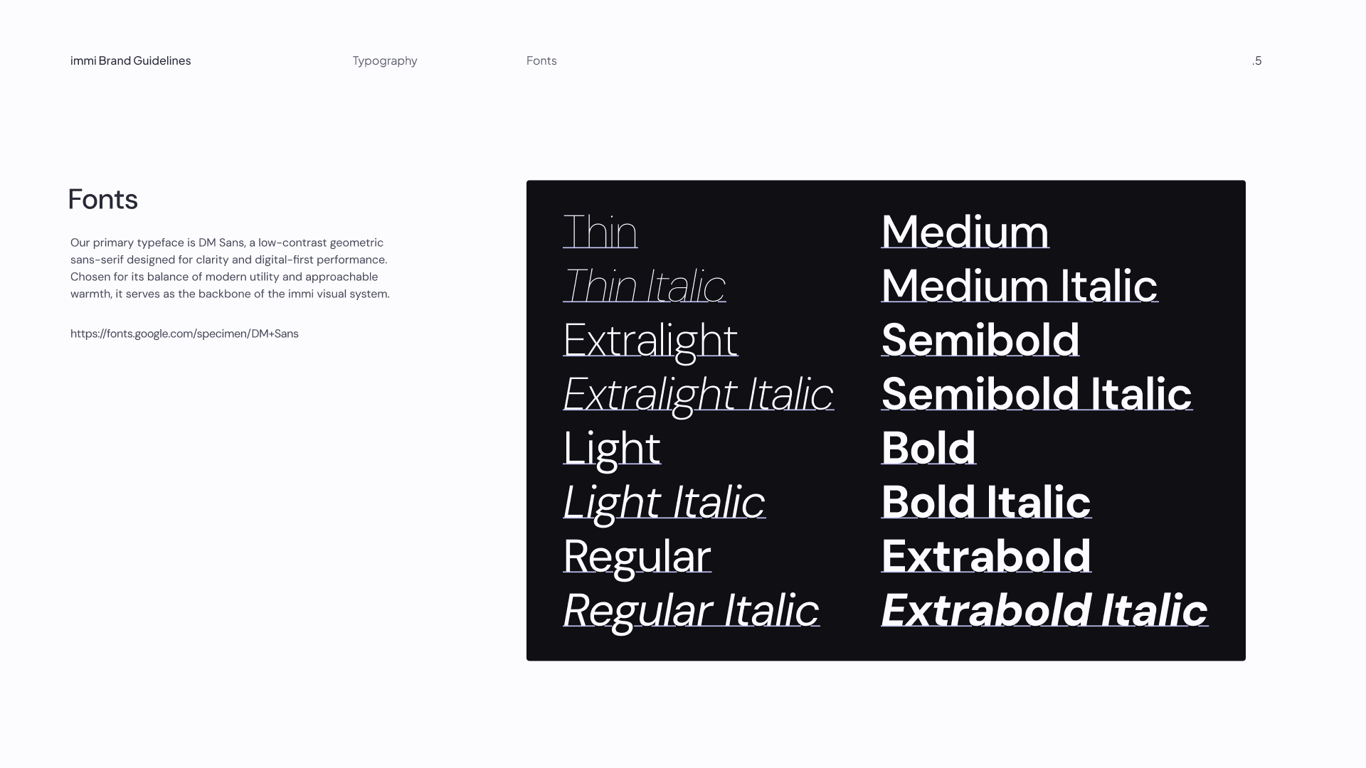
DM Sans
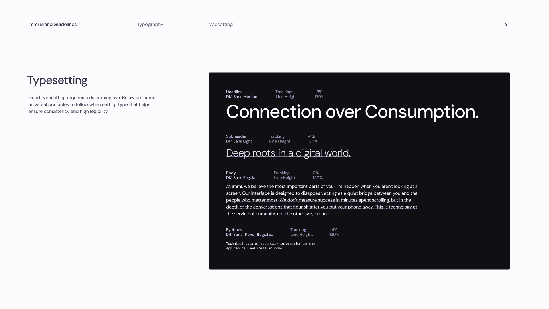
Typesetting
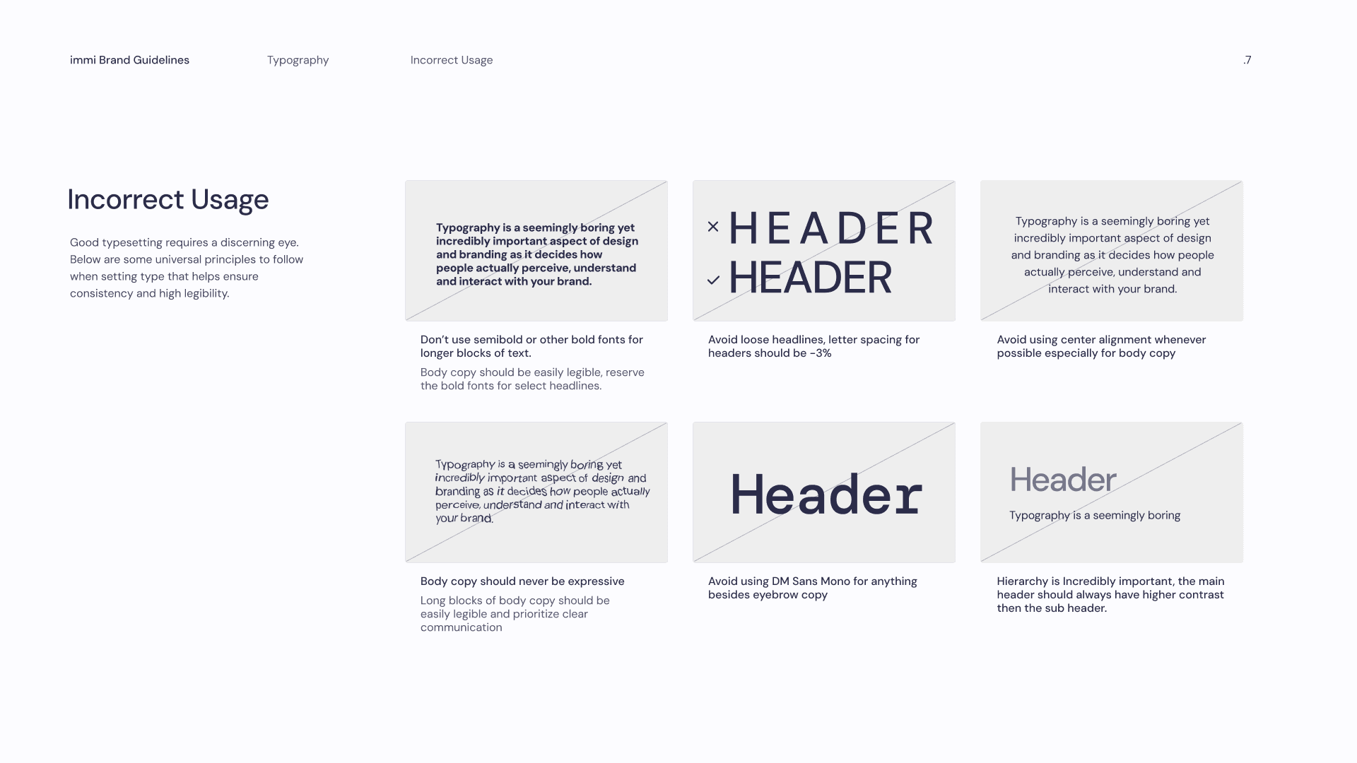
Typography No No's
Small aside about fonts, I originally loved Montserrat Alternates, however it includes a capital T that I can't think of a single use case for.
Why
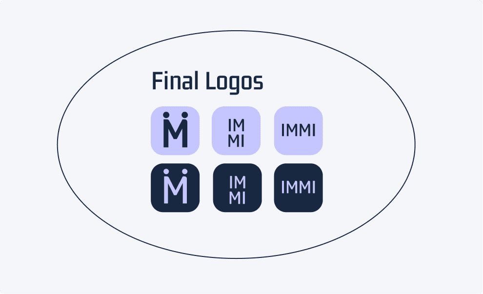
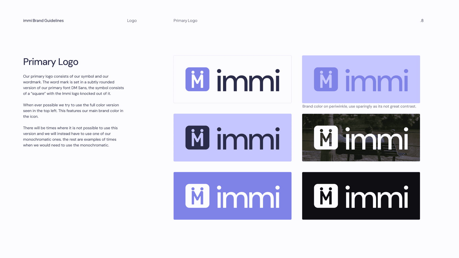
Logo
The founders’ original logo symbolized two people holding hands. I refined it into a knockout mark that could scale across the product and wordmark system.
I also led a brand color shift from periwinkle to a higher-contrast purple, ensuring the core brand color could be used consistently across UI, marketing, and accessibility-compliant components.
Original Logo
My Version
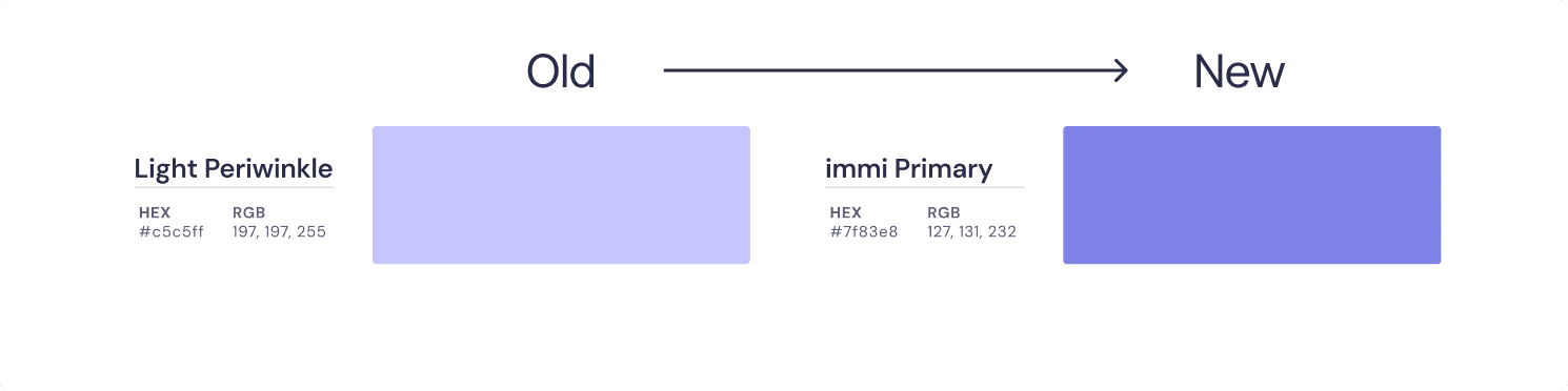
New Colors
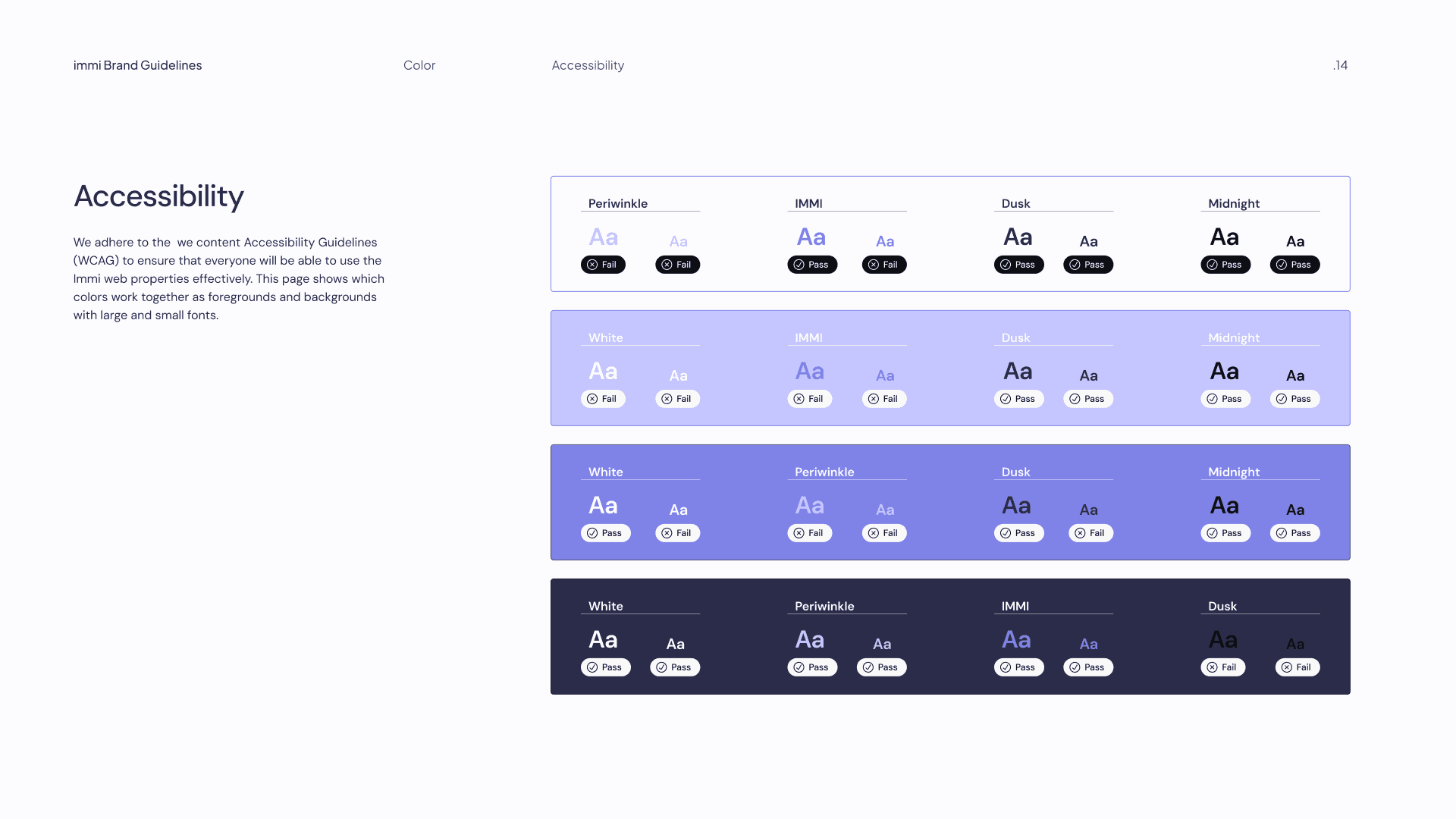
Accessibility Checker
The Final Colors
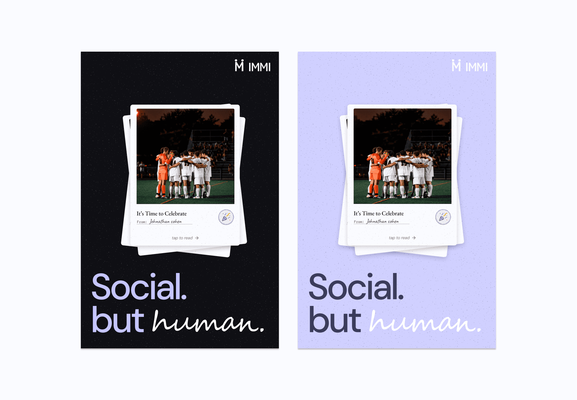
App Store Graphics
The final part of phase one was creating a new set of iPhone graphics to feature in the Appstore complete with all of our new brand guideline.
Phase 2: From Figma to Production
The brand is now being hardcoded into a production-ready environment. I am currently leading the development of a Type-safe Design System in React Native, ensuring that our 'Humanist' guardrails are enforced at the code level through custom TypeScript themes.
Back to Top